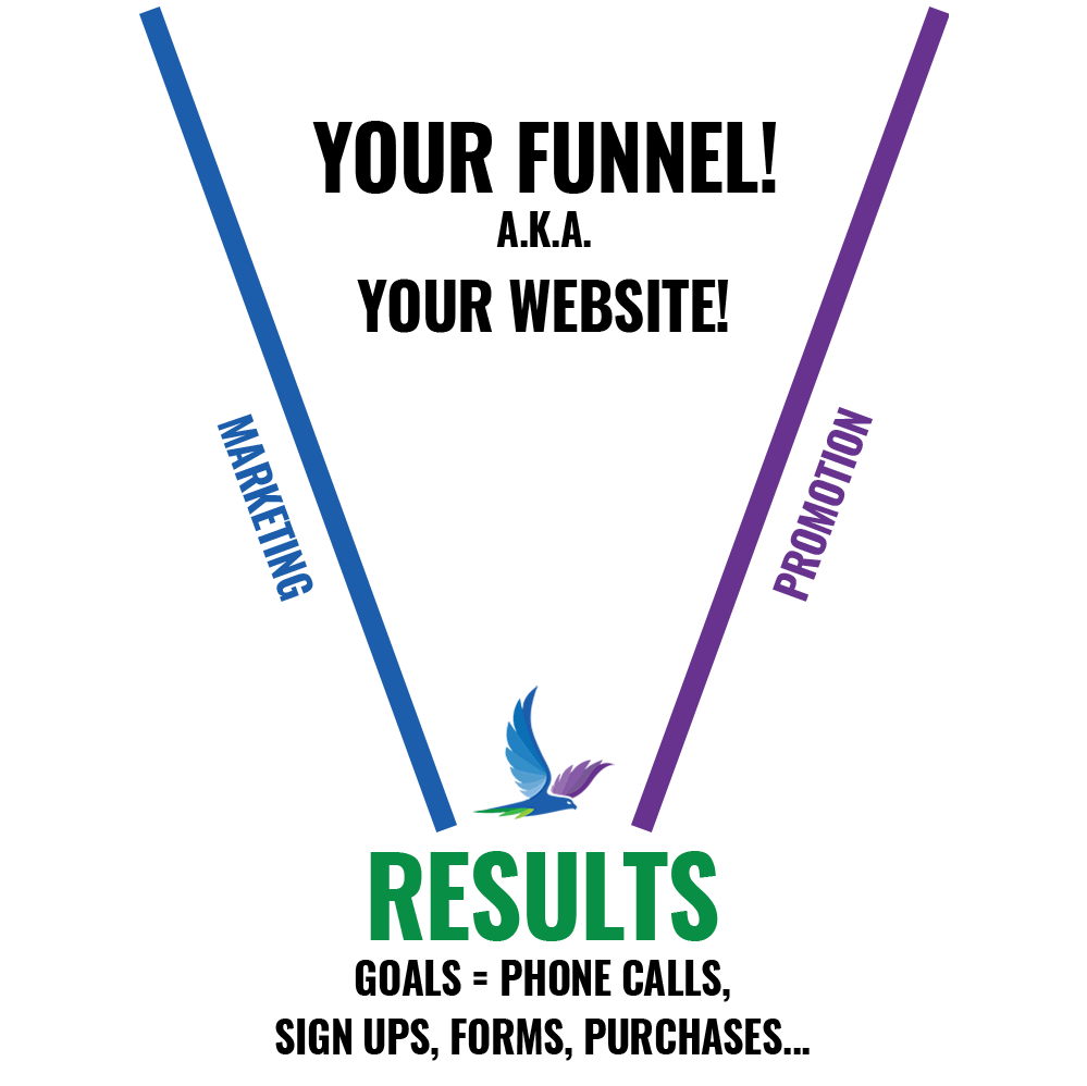
Think of Your Website as a Sales Funnel. You load your prospects at the top of the funnel and expect a certain percentage to convert into a lead or sale. This percentage is referred to as the conversion rate. The rate at which prospects become clients. There are things you can do to your website that can drastically improve your conversion rate.
Working at the shoe store, we had to learn some tough web site usability lessons. We created a website that sold New Balance Shoes based on which foot problem you had. We couldn’t compete on broad keywords such as “running shoes” because retail giants, like Nike, Reebok and Adidas were doing their best to keep us all on the second and third pages of Google.

Our answer was to create landing pages about common foot problems. Morton’s Neuroma, Plantar Fasciitis, Plantar Warts, Shoes for Diabetics… There were about twenty diagnoses that we targeted. A consumer would leave the podiatrist with a funky foot diagnosis and start searching on Google for a solution. As soon as they searched for keyword phrases such as “plantar fasciitis shoes” our site would come right up.
You would first choose your foot problem, then indicate your gender, and finally, your desired activity, choosing between Running, Walking, Cross Training, or Tennis. Once selected, we would show you the three or four shoe styles that we recommended for you.
The system was quite successful. Annually, we sold more than half a million dollars’ worth of shoes for foot problems for several years. Shockingly our conversion rate was only 1.5 percent.
Meaning, for every one hundred visitors to the site, one and a half purchases occurred. We continued to challenge ourselves to achieve a two percent conversion rate. A very small increase as a percentage would mean huge increases in revenue.
The Book That Changed Things For Our Website
We set out to do just that. We purchased the book; “Don’t Make Me Think – A commonsense approach to web usability” by Steve Krug. Steve highlighted common-sense marketing approaches that were commonly deployed around us all. For example, why is candy placed at the grocery store checkout? Why are department stores laid out in a certain way? We are being directed and guided constantly, without our awareness, for the most part.
With these real-world examples, Steve provided excellent insights on how your website should be displayed. More importantly, he demonstrated how to guide your visitors to take advantage of your calls to action.
We immediately deployed a few surprisingly basic adjustments. Right away, our conversion rate went up. We added the ability to add on accessory items such as insoles. Soon after, every third purchase included an insole upgrade. Better yet, as insoles and other accessories yield a higher profit margin. We added automated questionnaires and automated responses to help customers find the shoes they needed for their foot problems. Better yet, as we now could add many more people to our email list.
We removed clutter such as social media icons that were taking up highly valued real estate on our pages. It took some rethinking to get back to basics. When you’re browsing the internet trying to figure out what you would like your site to look like, remember the basics. Get away from flashy animation, never-ending carousels, and pretty icons. Get back to the tried and true methods that have worked for decades. Many of these concepts predate the internet itself.
Getting Your Website Funnel Ready for Conversion
Phone Numbers
Place your phone number on the top and bottom of every page. A phone call is the best action a visitor makes when visiting your website. The conversion rate of a phone call is almost always going to be higher than a contact form submission.
Calls to Action
On your website, place your logo on the top left and your strongest call to action on the top right. Adding a phone number that can be clicked on when using a cell phone is always a good practice.
Examples of Calls to Action
- Free Estimates, Call Now
- View Specials
- Sign Up for Savings
- Attend our Signature Event
- Create a Free Account
The Three-Second Rule for Your Website
The average visitor needs to be directed and understand what you do next on your website within three seconds of visiting. Commonly the only things seen at first glance are above the fold or before you scroll.
If everything is in the proper place, your logo, your strong call to action in the top right corner, and your hero image with a strong call to action.
You Will Lose If
- Your logo does not match your industry or lend a clue as to what your company does.
- If the name of your company does not lend a clue as to what product and services you provide…
- If your marketing message is vague or unclear…
Keep them on Your Website
Place social media icons on the bottom of your site. Now that you have a visitor in your funnel, you do not want them to leave. Especially if you paid for a boosted Facebook ad or a paid Google ad. Instead, use that call to action area to sell something.
Contact Forms On Every Page
Making sure there is a “Quick Contact Form” on every page is important. Quick, meaning only ask for the basics such as their name, phone number, and email address. Too many fields on a form can turn off the user.
Pro Tip: Adding a Call to Action at the top and bottom of every page increases conversion rates.
Example #1
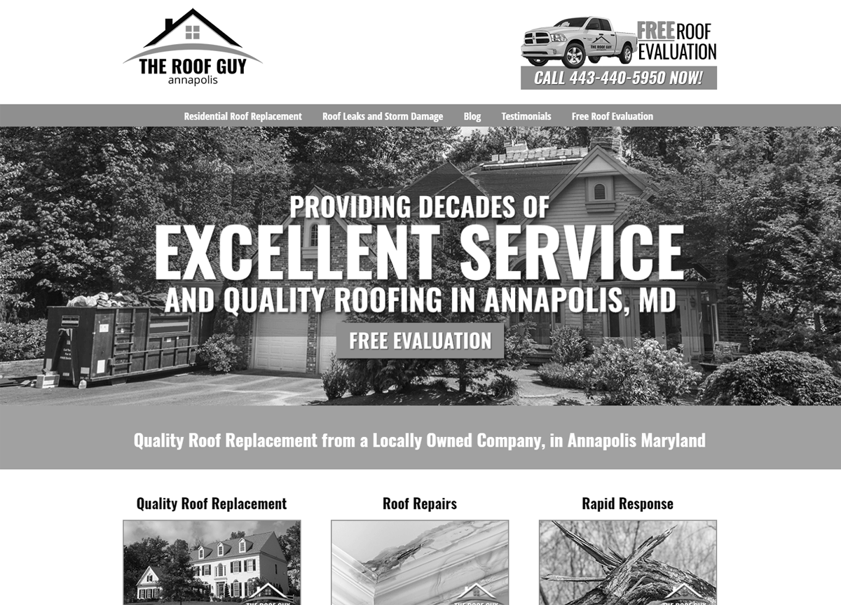
The Roof Guy Annapolis Home Page 
Notice the Strong Call to Action in the upper right. Also, note the Strong Call to Action in the main hero image. The industry is moving away from multiple slides because of usability and load times. Within seconds it is very clear what services The Roof Guy offers and what type of customer he serves.
Example #2
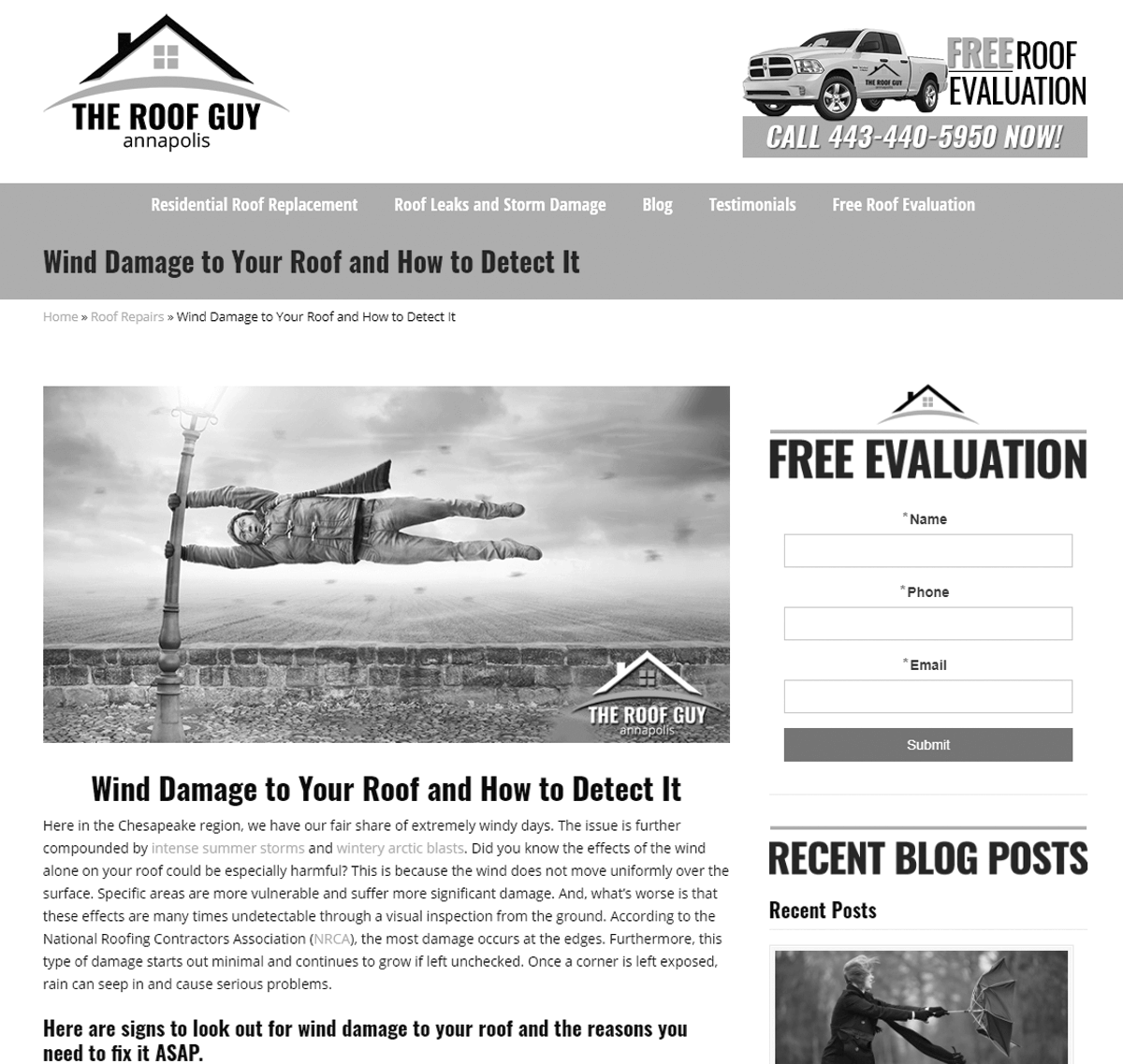
The Roof Guy Annapolis Landing Page

Description automatically generated
No social media icons on the top of the site. We pushed them all to the bottom. On this landing page, you can see that we have included a contact form with an additional strong Call to Action. Open, clean white space, simple design, with obvious direction. Remember, most sales are closed over the phone. Getting them from online to on-the-line is the key to a high close rate.
Your Website is Ready, Now What?
You now need the traffic to convert. What are your potential customers searching for, and how do they find you? Most in our local markets use Google and Facebook to seek out and find information. In a world of endless options, we recommend that you focus on the long-term investment of Google and use Facebook as a tool to drive immediate traffic to your website.
“There are only two ways to get traffic to your website, BUILD IT, or BUY IT!” ~ Lisa Cruz of Reach Local.
If your website could use a tune-up, or you need help driving traffic to it, contact us at Hawk Marketing for a consultation. We have marketing plans to fit your budget, so let’s sit down and talk about it. Reach out on the contact form below…

